Posts

Showing posts from October, 2017

Project 8 - Somewhere

Image
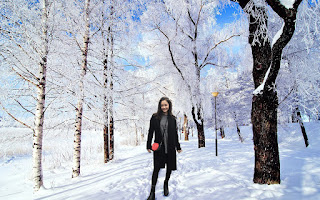
For this project, we had to place ourselves in an environment where we have never been before. I chose to place myself in this particular environment since I miss being in the snow. The challenging part about this project was adjusting the color of my face to the environment and the surroundings. Creating the shadows was not difficult since there were already shadows from the tree.

Project 7 - Autocopy

Image
For this project, we used Photoshop to make our photos we took look significantly different from the originals. I played around with color and texture a lot for this project to make it look more surreal.

Project 6 - Poster

Image
For this project, I got an image of Lord of the Flies poster from the internet image search and tried copying exactly like the poster using Illustrator. I personally really enjoyed this project since I got used to using pen tool and it was nice seeing how exact I could copy from the original photo. The difficult part was getting all the details of the trees and leafs.

Project 5 - Gradient Mesh

Image
For the Gradient Mesh project, we had to find a image of a fruit or vegetables against a white background from the Internet image search. Then, we had to convert this object into vector shapes using gradient mesh and other advanced illustration techniques. This project was pretty challenging for me since it was hard making it fake but also somewhat realistic. I had difficult times getting the colors right and playing with shadow colors. 

Project 4 - Business Card

Image
We used the logos we have created before and created 2 business cards. For both business cards, I used the same color theme as my logos. I wanted to keep both the front of the business cards simple but make it stand out by using these vibrant color against black and white letters, boarders, and backgrounds. For the back part, I also wanted to keep it simple and clean so I have a lot of white space but by adding thing yellow and red lines, it adds a little touch to the cards.

Project 3 - Logo

Image
For this Logo project, we had to create our own logos using illustrator. For the first logo, Keito Entertainment, I incorporated my name into it. The color theme of yellow and black is inspired by the movie Kill Bill. I also wanted to incorporate different shapes within one logo. For the second logo, Base Co, I decided to keep it simpler than the first one. I decided to make the words go downwards and left rather than horizontally since in Japanese, you write things downwards. I was originally going to the color of red and white to represent the Japanese flag but I decided with black since it dramatic and stands out.